Trail Finder - Hiking Application

Overview and Problem
While attending the UX/UI Design program at Thinkful, we were tasked in finding a client that is in need of an app or website. In response to this, I posted on Facebook to my family and friends asking for their app ideas. My childhood best friend’s mother commented on my post. She stated that she believes it would be nice to have a hiking application that would track calories, weight loss, and prompts for when to complete a hike. Not only was my client the only individual that responded to my post, but I felt that this app idea was a good challenge. After some discussion, we determined that our target audience would be those between the ages of 20-40 or anyone who would want to better themselves and find new hiking adventures. Towards the end of the project, I created a prototype that would allow users to filter hikes in the desired area with desired activities and accessibility to those with pets or those who need wheelchair access. During their search, they would see a variety of different trails in their desired parameters and possibly trails that they have never heard about.
Research Process
Immediately I saw two challenges with this type of application: motivation and user retention. I wanted to focus on this during this project and how we could potentially maximize motivation for the user to accomplish their goal. To start this project, I sent out a survey to gain an understanding of people’s past experiences with workout applications. In this survey, I asked the participant “Have you ever used a fitness/workout application?” Depending on their answer, the survey would take them down a path asking them different questions. If they responded “no,” they would then be asked, “Could you ever see yourself using a fitness/workout application in the future?” After this question, I ask them to elaborate on their answer. 40% of the individuals that said “no” to my screener question responded by saying they were skeptical about how they work or have heard negative feedback from family or friends. If the user responded “yes” to my screener question, they would then be asked, “do you still use this application?” Surprisingly, 71.4% of the participants answered no. They were then asked to elaborate based on their answer. One stated, “There was little to no motivation.” Another participant added “I accomplished my goals. Felt there was no need to continue. Might revisit when I need to accomplish my goals again.” From this survey, I gathered that a lot of my participants were not motivated to keep using the application. Either after accomplishing their goals or feeling stuck, they gave up and deleted the app from their device.


Discovery
While my survey was live and participants were answering my questions, I did a little bit of research on my own on why users uninstall apps and the cause behind it as well as why people get motivated to complete certain actions. I found that individuals respond more to Extrinsic rewards compared to Intrinsic rewards. Extrinsic rewards are an award that is tangible or physically given to you for accomplishing something while Intrinsic rewards are intangible rewards, a sense of achievement, or conscious satisfaction; i.e digital rewards. After this finding, I also wanted to find out why people uninstall applications. On clevertap.com, I found information relating to this. They say that 39.9% of applications that are uninstalled are not in use. This perfectly applies to fitness/health applications since users have little to no motivation to use the apps so they uninstall the application to clear space or just because it is not in use anymore.

After I gathered all of my research and compiled everything together, I presented it to my client. I expressed my growing concern for motivation and how we could exceed user expectations. My client recommended that we use digital rewards such as stars, motivational quotes, and showing their process through graphs and other forms of digital motivation. We both agreed that we would brainstorm more ideas on how we could accomplish maximum motivation through our app and would collaborate on our next meeting.
The day after our meeting, I began creating a persona. Dana is an individual very close to our client and agreed to be our guinea pig for our project. Dana is a family driven woman and loves spending time with her family and playing World of Warcraft. Recently, she has gotten into the fitness world and wants to better herself. Currently, she has started doing yoga in her house and going on walks in the evenings. Her main goal in life is to complete a 5k without feeling like she is going to die. My client and I wanted to focus on that and figure out how we could help her accomplish her goals. While exploring her growing interest in fitness, she expressed her love for hiking and how she wishes there was an easier way to find trails in her area (). In these figures, I focused on the User Persona, Empathy Map, as well as a customer journey for Dana while getting a gym membership. She expressed how her experience was negative since when she left the gym, they faced her with negative feedback and unexpected fees. I wanted to visualize her experience in my customer journey map to see what our app could potentially improve on.


Information Architecture
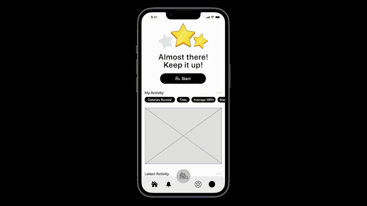
After the research portion of our project is complete, we can finally start applying our findings to our application and find a design that fits our needs and goals. I wanted an interface that was easy to use and able to accomplish goals very easily. Before I can get into different designs, I started with sketches to help me layout some of the ideas that were brewing in my head throughout the research process. For my sketches, I used a method called “Crazy 8’s.” Not only to try out multiple ideas, but using this method it divides the page almost perfectly to make phone-like rectangles. At first I played around with the idea of either a half circle or having stars to show the progress the user would have during the week. My client mentioned to me that if they complete 3 hikes (big or small) within one week, they would get all three stars and accomplish their goal for the week. I felt that the stars had more weight to them since they were more fun to look at and could potentially have animations that could be added later within the prototypes. After debating with myself over this design aspect, the rest of the application was simple to sketch out.

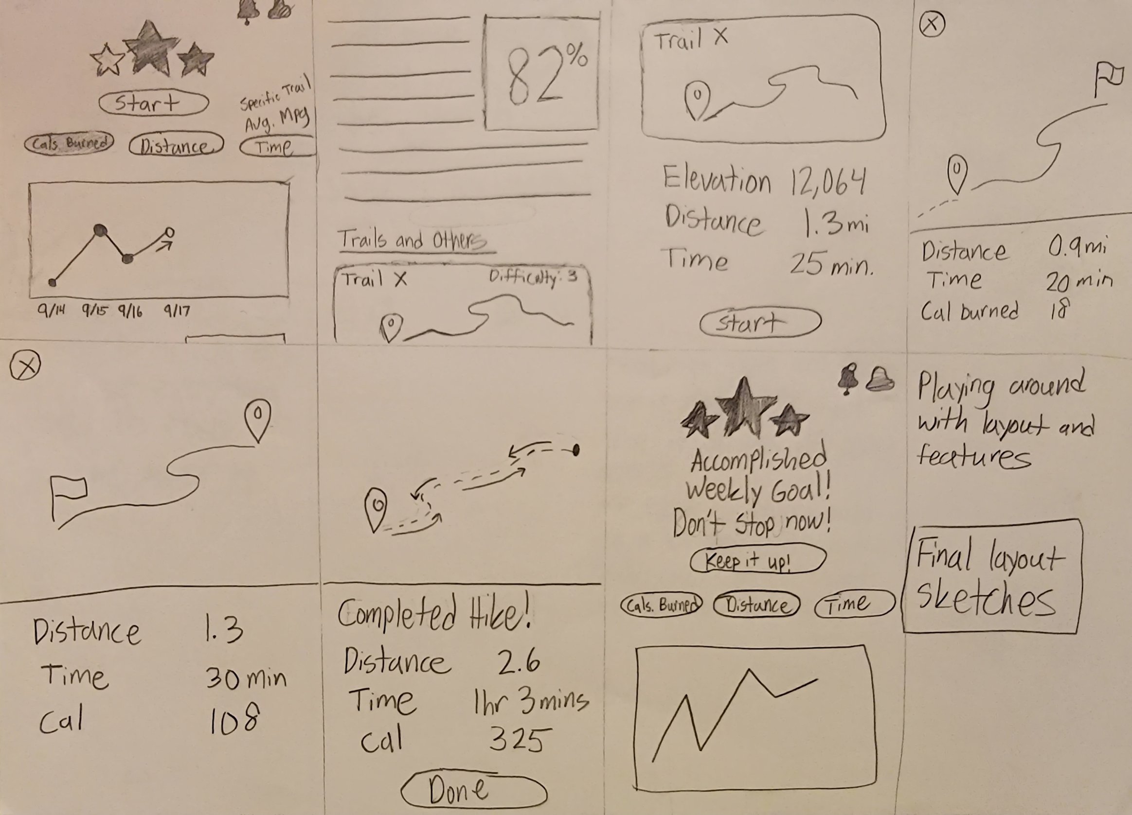

While finishing up my sketches, it was finally time to start crafting my digital wireframes. The first stage is to build it as a low-fidelity wireframe with minimal colors and images unless absolutely required to show a function of the application. I started with a site map and a user flow to help me map out the application to make the design process smoother.


After finishing the site map and user flow, I was finally ready to start working on the low-fidelity wireframe. While showing minimal color and images I created a simple application with icons, buttons, and large/bold text. While making the prototype, I kept accessibility in mind by keeping text large and bold by having the smallest text size be 16px. Also I made any interactable icons have an invisible touch box that’s at least 44 pixels wide by 44 pixels tall. That way those who are viewing the prototype on devices can interact with the prototype with ease and will not need to worry about hitting a specific spot on their screen to participate in testing. I have included the overall prototype and a GIF image of someone interacting with the application.

Usability Testing
While on the topic of testing, we continued with the development process by doing usability tests. This includes quantitative and qualitative data. Unfortunately, I only had 7 people sign up for the usability tests, but ultimately it is tremendously better than only having one or two testers. I gave my participants three different scenarios. This included the following:
Start a hike
While searching for a hike, find the filter for “dog friendly” trails
Find where you can purchase the subscription
I created my usability test on maze.co which collects data on where people click and helps determine the direct success rate for my application. For my first scenario, I had a 86% direct success rate, which was very good to see. For the second scenario, I had a 42.9% success rate. During my qualitative testing, one of the individuals said that they did not realize that it was in the accessibility section of the filters, but it made sense why it was after they found it. This is most likely what happened with the other users taking the test. Finally, for my third scenario, I also had a 42.9% direct success rate. The same user that commented on my last scenario stated “it was a little confusing that the icon was associated with the subscription. Maybe something more noticeable would have helped with that.”
Future of the Project
After completing my usability testing by gathering qualitative and quantitative data, I can finally start concluding this project before starting the high-fidelity prototype. For my future goals, I want to add colors and images to help define it as a high-fidelity prototype. After doing this, I might play around with more layout options/changes as well as the addition and removal of some features such as a purchasing screen where the user could explore what purchasing a subscription would look like. I could also do a final card sort where multiple users could put filters in different places that they feel would be easier to find.
At the start of this project, I knew it was going to be a challenge. Especially since there are more than 71,000 fitness apps on the app store. I really wanted to go above and beyond my research to understand how I can make the application stand out even in the low-fidelity stage. While going into my high-fidelity prototype, I will keep an open mind on how I can accomplish these goals and possibly even come back to it later to add or remove design choices I made.